demo-gallerator
Demo of gallerator
To see the galleries actually render, view this page as: https://pmorch.github.io/deleteme-demo-gallerator/.
To see the galleries as source code, view this page as: https://github.com/pmorch/deleteme-demo-gallerator.
The demos
In the following the --name-of-gallery argument was passed to every demo, but
that is optional. Without that argument, the galler would be named after the
base-name of the media source, or media in these cases. But for demo purposes,
we’d like to easily be able to distinguish them.
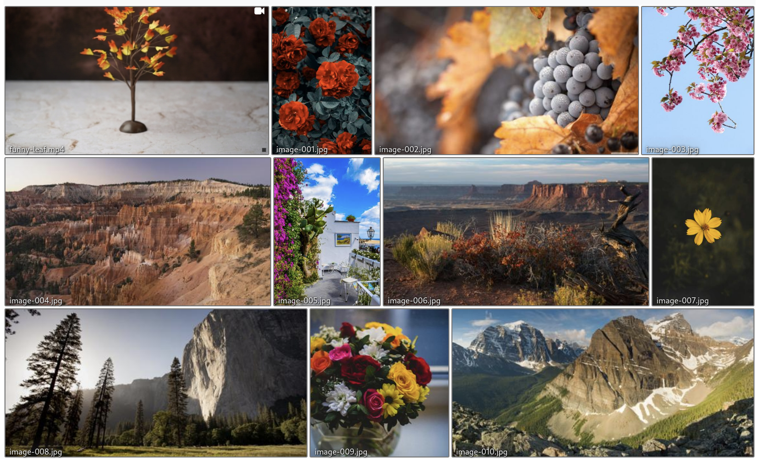
Standard gallery
This is the gallery you get out of the box with just
gallerator --name-of-gallery Standard --gallery standard-gallery media
By default a “justified” gallery is created where all image thumbnail have the
same height: --height, but the width can differ:
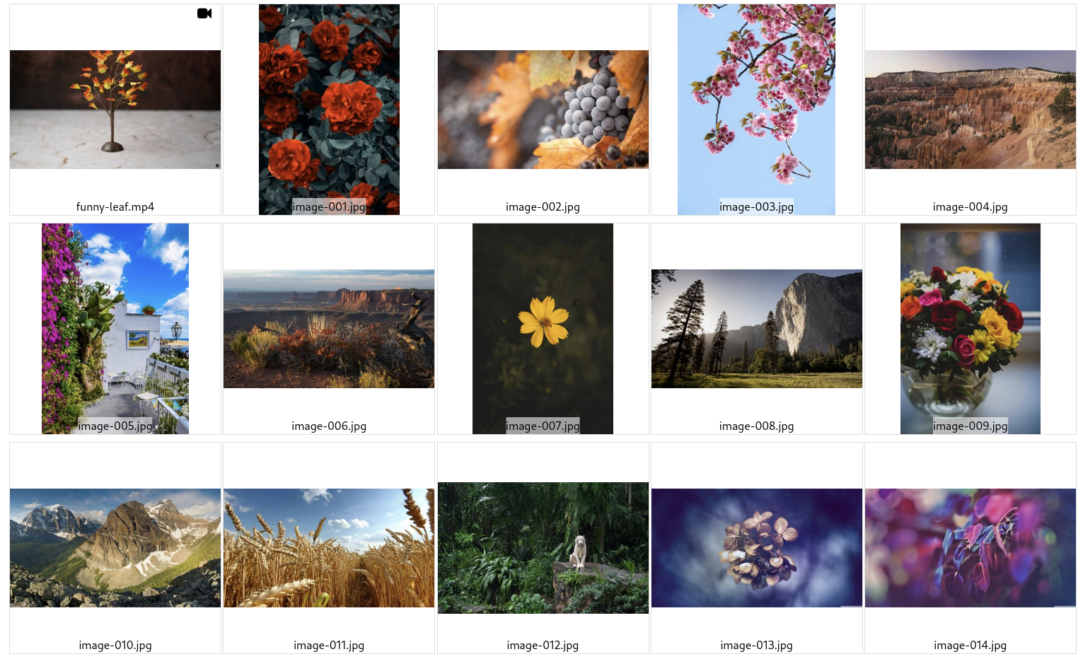
Recursive gallery
Here the --recursive has been added, so:
gallerator --name-of-gallery Gallery --gallery recursive-gallery media \
    --recursive
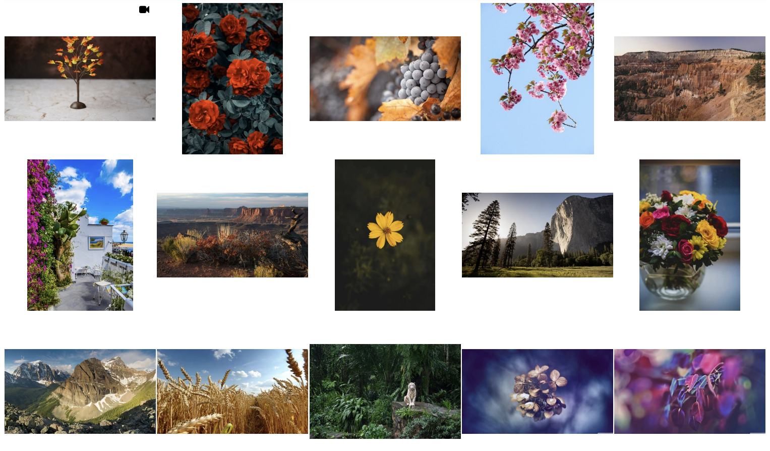
Pagination gallery
Here the --pagination 20 has been added, so there are maximum 20 images on
each “page” with the last page perhaps having fewer:
gallerator --name-of-gallery Pagination --gallery pagination-gallery media \
    --pagination 20
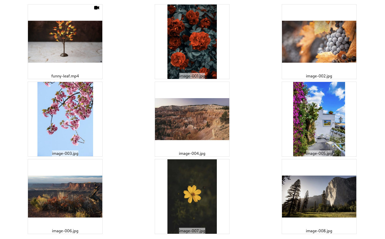
Auto-grid gallery
Here the --auto-grid has been added, resulting in a page where all thumbnails
are constrained within a container of width: --width and height: --height:
gallerator --name-of-gallery Auto-grid --gallery auto-grid-gallery media \
    --auto-grid
Nameless auto-grid gallery
Demo of nameless auto-grid gallery
Here both --auto-grid and --no-filename-captions have been added, resulting
in a page where all thumbnails are constrained within a container of width:
--width and height: --height but there are no file names. This currently
gives a cleaner look to the grid layouts.
gallerator --name-of-gallery "Nameless auto-grid" --gallery nameless-auto-grid-gallery media \
    --auto-grid --no-filename-captions
Grid gallery
Here a --grid 3x3 has been added, resulting in a page 3 columns of 3 rows of
thumbnails are constrained within a container of width: --width and height:
--height:
gallerator --name-of-gallery "3x3 grid" --gallery grid-gallery media \
    --grid 3x3
This gives a predictable layout with constant amount of columns, but it is not responsive, so it may not look great on mobile devices or on very wide screens.
Usage
usage: gallerator [-h] [--name-of-gallery NAME_OF_GALLERY]
                  [--gallery-dir GALLERY_DIR] [--recursive]
                  [--pagination PAGINATION] [--renderer RENDERER]
                  [--justified] [--auto-grid] [--grid GRID] [--width WIDTH]
                  [--height HEIGHT] [--no-filename-captions]
                  source_dir

Create static thumbnail galleries

positional arguments:
  source_dir            The directory containing the source images and videos
                        over which we want to create a gallery.

options:
  -h, --help            show this help message and exit
  --name-of-gallery NAME_OF_GALLERY
                        The name of the gallery. Defaults the base name of the
                        'source_dir'. (default: None)
  --gallery-dir GALLERY_DIR, -g GALLERY_DIR
                        The directory in which to store the generated gallery.
                        Defaults to the same as the 'source_dir' containing
                        the images. Note that this directory should be "close"
                        to the `source_dir` since relative paths are used when
                        referencing source images from the gallery or you'll
                        get many '../' elements in the image paths. (default:
                        None)
  --recursive, -r       Whether to search for image and video files
                        recursively. (default: False)
  --pagination PAGINATION, -p PAGINATION
                        The maximum number of images per page. 0 means
                        unlimited. (default: 0)
  --renderer RENDERER   Which renderer to use to actually produce the output
                        galleries. At the moment, there are two built-in ones:
                        "PhotoSwipe" and "nanogallery2". Advanced: Other
                        values will be loaded as a module that is expected to
                        have a renderer() method that returns an instance of
                        gallerator.data_types.Renderer. That way you can
                        render the gallery exactly like you want. (default:
                        PhotoSwipe)

Photoswipe:
  These are the arguments for Photoswipe, the default renderer. Different
  renderers have different options, so try "--renderer name-of-renderer
  --help" to see options for other renderers.

  --justified           Use a justified layout (the default), where all images
                        have the same height, but the width depends on the
                        image. This is the most dense but different pages may
                        not have the same height if used with pagination, so
                        perhaps one other layouts are better with pagination.
                        (default: False)
  --auto-grid           Use a grid layout but fit as many columns as will fit
                        depending on screen width. (default: False)
  --grid GRID           By default, Photoswipe uses a justified layout, but
                        this will create a grid layout. Try e.g. "--grid 4x5",
                        for 4 columns by 5 rows, but supply your own "XxY"
                        value to set your own grid layout. This will override
                        any --pagination value. Beware that this is not
                        responsive, so it will either be too wide on mobile or
                        too narrow for large desktop users, or both. (default:
                        None)
  --width WIDTH         The width of the thumbnails. Only used by --auto-grid
                        and --grid (default: 300)
  --height HEIGHT       The height of the thumbnails. (default: 300)
  --no-filename-captions
                        Don't add the filenames of the images as a caption in
                        the thumbnail gallery. This makes it look cleaner
                        (especially for --grid and --auto-grid), but less
                        information for the user. When the full image is shown
                        in a lightbox, the file name is always shown,
                        regardless of this setting. (default: False)
Origin of the media files
`.jpg’ images
The .jpg images files come from this reddit
post
and in turn from
imgur
And a few portrait *.jpg files from:
https://www.pexels.com/search/nature/
.mp4 videos
Come from https://www.pexels.com/search/videos/
Media post-processing
I have categorized them a little, reduced the file size with help from Efficient Image Resizing With ImageMagick — Smashing Magazine:
find -iname '*.jpg' -exec mogrify -filter Triangle -define filter:support=2 \
    -thumbnail 1500 -unsharp 0.25x0.08+8.3+0.045 -dither None -posterize 136 \
    -quality 82 -define jpeg:fancy-upsampling=off \
    -define png:compression-filter=5 -define png:compression-level=9 \
    -define png:compression-strategy=1 -define png:exclude-chunk=all \
    -interlace none -colorspace sRGB \
    {} +
ls -1 | sort -V | tr '\n' '\0' | xargs -0 renumber-files --base image-